Blog > How to Reduce the Bounce Rate of Your Website

Jack Lloyd
Product Marketer
First impressions are everything and this applies to having an online presence no less. If you’re at a point where you’re receiving traffic to your website, but the people visiting your site aren’t taking action. It could be time to look at your bounce rate.
So why is bounce rate important?
Bounce rate is the percentage of people who land on your page only to leave without taking any kind of action. Typically, the lower the bounce rate of your page, the more helpful it has been to your visitors by providing them with the information they are looking for.
Improving your bounce rate can also improve your SEO. It’s a really helpful indicator to search engines that the value you have on the page is useful to those searching for it. Therefore, the benefits are twofold. You’re helping your visitors have a better first experience of your site which can improve conversions, and it could improve your visibility online.
In some cases, the bounce rate of your pages will naturally be quite high. For example, blog pages have a higher bounce rate as they tend to give the person the value they’re searching for without needing to go anywhere else on site. However, if your home page has a high bounce rate, it can be an indicator that people aren’t finding what they’re looking for on the page, or something else is getting in the way of them continuing their journey with you.
Where do I see my Bounce Rate?
It’s easy to see the bounce rate for any page in Google Analytics. Pick from the left-hand menu Behaviour >> Site Content >> All Pages. It will show as a percentage of the number of visitors to that page who then bounced.
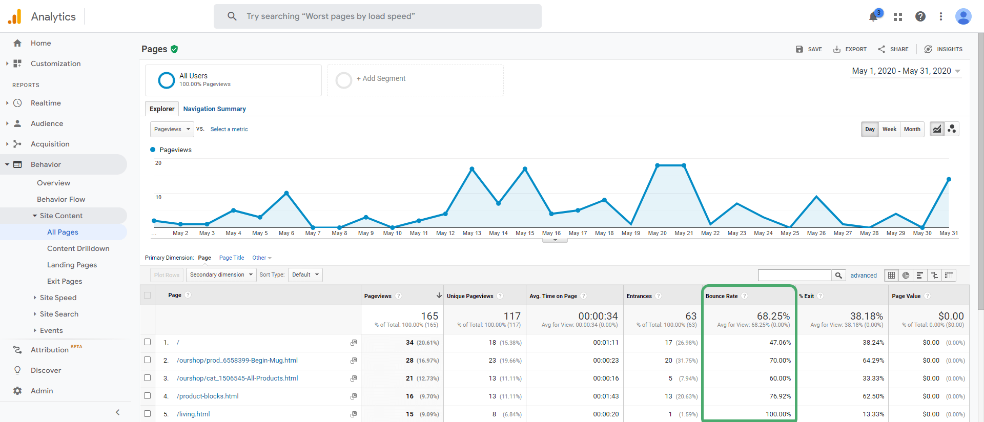
By clicking the column heading for bounce rate, you can also sort your list of pages to see which are performing better than others.
This is really useful for seeing where you’re performing well and if there are any common denominators between your best-performing pages that you can replicate on the pages that aren’t yet doing as well.
At the top of the table of data, there’s also a search bar that you can use to find the data for any specific page on your site. If you already have a page in mind that you’d like to focus on improving, take a look at the data for it here.
Bounce rate, time on page and exit rate can all be incredibly useful for determining whether people are finding what they’re looking for or if you aren’t yet making that all-important first impression and they’re leaving before taking action.
What is a Good Website Bounce Rate Benchmark?
It’s important to note that you should expect different bounce rates for different types of pages. It comes down to intent.
Let’s say you have a product that people are finding and are coming to your website to make a purchase. There’s a lot more intent there to take further action on your site than, let’s say, someone coming to read a blog.
In the case of a blog, most people will read what they’ve come for and leave. Hence why blogs typically have a much higher bounce rate than product pages on ecommerce stores (this is why you should have email sign up options on your blog!).
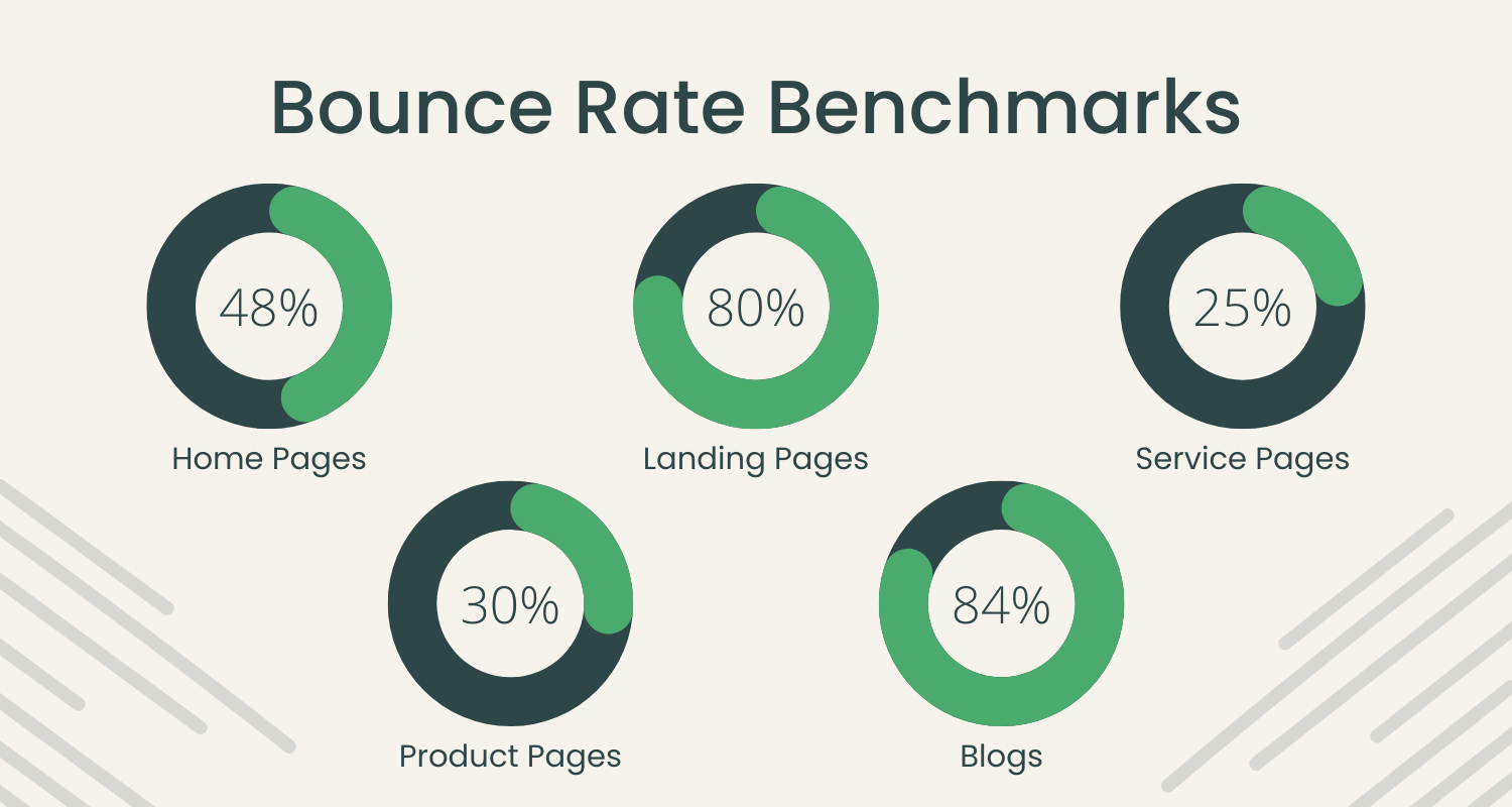
Average Bounce Rate by Page Type
I’ve listed the average bounce rates for certain types of pages. You can use these as benchmarks for when you focus on improving your scores. If you can get to around these numbers, you’re doing well for your page. If you can beat them, you’re excelling.
-
Home Page = 48%
-
Landing Pages = 80%
-
Service Pages = 20%
-
Product Pages = 30%
-
Blogs = 84%
When it comes to SEO, search engines take these kinds of benchmarks into account. They will be comparing your bounce rate to your competitor’s. If you can beat these benchmarks, you will have an edge over other people trying to appear for the keywords you’re focusing on.
Reasons for High Bounce Rates and How to Fix Them

There can be any number of reasons that a page has a high bounce rate. The only way to determine this is through thorough testing.
This is a simple process of making a change at a time, waiting to see what impact it has and carrying forward the change if it has made an improvement to your data.
As mentioned previously, you can potentially speed up the process of improving your bounce rate by implementing common traits of your best-performing pages on your pages that aren’t where you’d like them to be yet.
Once you’ve done that, if you’re bounce rate isn’t yet at the percentage you’d like it to be, here are some common reasons for a higher bounce percentage to look out for:
Drive the Right Traffic to Your Pages
The problem with your bounce rate could be nothing to do with your page. It could instead be about who you’re driving to the page.
The people you are driving to your page should be prequalified to be your ideal customers or clients. They should have a specific reason for visiting your page and so your page should enrich their lives or give them something to gain by being there.
This is why it’s so important to build out customer personas of who your ideal customers or clients are. You should know exactly who it is you are trying to reach and speak to their wants or needs as soon as they land on the page.
If they can’t see why the page they’ve landed on will benefit them as soon as possible, they could feel inclined to continue their search elsewhere.

This also applies to what keywords you’re trying to rank your page for. The page you create should match the intent of what people are looking for in search engines.
Take a look at the first page of Google. What do the top results offer to searchers? If the top results are product pages, you’d be better served also creating a product page than something like a blog about what you offer.
Google knows that the people using this keyword are at the stage in their buying journey where they’re ready to make a purchase, not to become more informed on options available in the market.
The key here is to make sure you’re matching intent every step of the way. Consider where people are in the buying journey and that you’re speaking to the desires of your ideal customers or clients as soon as they land on the page to decrease the chances of them bouncing.
Bring Key Information to the Top of the Page

Following on from the previous point. When structuring your page, it can be tempting to write your content so you lead up to the key points that inspire action.
Many people write to firstly justify the points they’re making rather than immediately showing what the key value of the page is.
You should work to outline the key value of the page at the start of your content. That way, your visitors can see immediately whether or not your page is what they’re looking for and will help them.
If it’s not possible to do so, you could outline where they’ll find this information on the page, or even better, provide them with anchor links to jump straight to the section of the page that’s relevant to them.
Make Your Content Scannable

When talking about your business, products or services, it’s easy to write paragraphs and paragraphs of useful and interesting content that you feel is relevant and helpful to people.
The problem is that with so much information at our fingertips, people don’t have the patience to read walls of text in order to find the information that’s useful to them.
It’s a sad truth that no matter how inspiring a piece of content is that you’ve written, if it’s not scannable, it’s very hard to maintain most people’s attention.
This doesn’t mean you can’t say all that you want to say about what you have to offer. The secret lies in how you structure your writing. Here are some ideas:
-
Keep paragraphs short - Too much text can feel overwhelming. Short paragraphs can help people pick out the sections of text that are relevant and allows them to properly digest the message you’re trying to convey
-
Use Sub-Headings - Headings make it easy to pick out the section of content a person is looking for. It helps organise your information so those visiting your site don’t have to read everything to find the value they’re looking for.
-
Use Bullet Points - For example, like I’m doing right now! I’m highlighting exactly what you can do to make your content more scannable. They jump out of this section of the blog and offer helpful information, even without you having to read the preface.
-
Break Up Content with Images - an easy way to make a wall of text look less intimidating is by adding relevant images to brighten your content and provide context to the sections of your page.
-
Highlight Key Points with Formatting - You can use Bold, Underline and Italics to make the key snippets of information stand out on your page. If there’s a message you want people to take away, this helps it stand out on the page
These are all really helpful for your visitors, but they can also be really beneficial with regards to optimising for search engines. Many of the above points are ideal ways to provide context to search engines so they can understand what passages of text are about, and can highlight key points in your content.
Improve Your Page Speed

We live in an age of superfast internet. People expect to be entirely unhindered as they browse websites. If a page isn’t loading fast enough, many won’t think twice about looking elsewhere for what they want.
Making sure your pages are loading fast enough is critical to success online. Not only is it vital for the convenience of your site visitors, but it has been identified as a key ranking factor in search engines as well.
Did you know that a slow loading site is also worse for the environment? It’s likely loading more resources and doing so inefficiently. This all comes with a carbon cost that can stack up over time.
In short, there’s every reason to make your site speed a priority, for your visitors, for your SEO and even for the planet.
A great place to start is our Website Eco Checker. It will tell you whether the host you are using is sustainable or not and it will also give you an insight into the speed performance of your site. It also offers a few ideas to improve your page speed too.
We’ve also written about how to optimise your website for speed and sustainability in detail. Be sure to take a look to make sure your site speed is performing as it should.
Create Clear Calls-To-Action

A Call-To-Action (CTA) is an action you want a visitor to take, typically in the form of a button or link leading them to the next step on your website. Every single page should have its own CTA.
The secret to creating the best CTAs and encouraging your visitor to take the action is to think about their journey on your site. What’s the objective you want them to accomplish and where do you need to lead them to help them complete the objective?
For example, if you have an ecommerce store and you want a visitor who has landed on your home page to browse your products, you could use CTAs on your home page like a carousel of featured products or best sellers. We’ve written about leading visitors towards an objective in detail and you can find lots of inspiration on how to do so in that blog.
For the best effect, try not to distract with links to other pages on your site. You should make every effort to make sure you’re leading a visitor to one singular next step so it’s clear what they need to do next.
Streamline Your Navigation

Wherever a person is on your site, navigating elsewhere should be a breeze. It’s important that you have your CTAs of course, but if a person has other ideas as to where they want to go on your website next, the most important pages of your site should be prominently displayed.
The way to ensure this is through your Headers and Footers. They are the constant throughout every page on your website (unless you’ve explicitly made a decision to remove them). Wherever a person is, they can find the most relevant resources on your site and navigate to them.
When thinking about your Header Menu, we need to again come back to what the objective of your website is. From left to right, your header menu should guide a user along a journey to making a purchase, enquiry or whatever goal you have in mind.
Therefore, you should feature these most important pages in your Header Menu. Pages like your privacy policy, terms and conditions, shipping, and even your About page could all be placed in the footer. They’re likely not critical for someone on their journey through your website, but should still be accessible.
Utilise Testimonials
![]()
We can never stop emphasising the importance of testimonials. They’re amazing for conversions, but they’re also great for validating to your website visitors that what you have to say or offer is credible.
The words of your happy customers lend a lot of weight to your business. Displaying them prominently on your page is easy through the use of Testimonial Blocks on Create or by embedding them straight from sites like TrustPilot or Facebook.
You could also use the power of other brands that have endorsed you or work with your closely. You can use a Logo Block to display their logos so that their brands can also build your credibility.
People need to know that they can trust a website before they take any significant action. The words of happy customers or the endorsement of credible brands can have a massive impact on a person’s decision-making process to stay on your site.
It’s Time to Make Sure Your Website is Responsive

Your website has to be able to adapt to perfectly fit whatever screen it is being viewed from. Whether that’s desktop, tablet or mobile.
In fact, the chances are that a huge proportion of your visitors are finding your site on mobile. If your site doesn’t work properly on mobile, they will almost certainly bounce.
When I say work properly, I don’t mean that it can viewed on a mobile. I mean that it needs to feel like the website was designed to be used on mobile, just as much as it is designed for desktop or tablets. There should be no need to scroll from left to right, buttons should not be too small to press, text shouldn’t need to be zoomed in on before you can read it.
If your hosting provider or website building platform doesn’t offer responsive templates. It’s time to find one that does as they’re doing your website and brand an incredible disservice. The detriment this will be having to your site will be reflected in your bounce rate and in your search rankings.
The web is designed to be mobile-first now and websites that haven’t adopted this practice are falling behind.
It’s easy to switch to a mobile-friendly template on Create and we have dozens to choose from. Why not start a free trial and see what you can build? Our friendly Account Managers would be happy to help with any questions you may have.
Want Your Own Website?Start Building Today!
No credit card needed. By submitting this form you agree to our T&Cs and Privacy Policy.
Test Everything
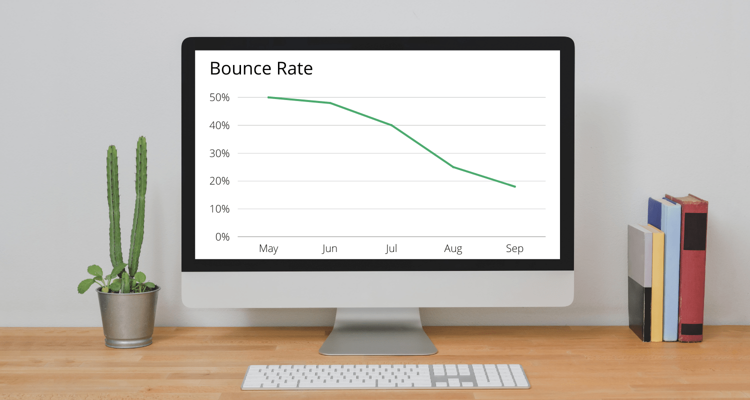
Everyone would like to see their bounce rates drop by 30-40% like above, but the secret to achieving this lies in thorough and continuous testing.
This doesn’t need to be as tedious or difficult as it sounds. In fact, it can be incredibly exciting to see that a change you have implemented has had a significant impact on your results.
All you need to do is implement a single change at a time. Monitor the impact it has had over the course of a month or so and decide whether or not to keep the change or try something new.
If you find something has worked and improved your bounce rate, there’s no stopping you from implementing this change on more of your pages.
Over time, these small incremental changes will start to stack on themselves. It doesn’t matter whether you use the ideas above to improve your bounce rate or try something new and innovative. So long as you monitor your changes, you will start to see dramatic improvements in your site’s performance.
This doesn’t just apply to bounce rates. This could be clickthroughs from changes to your metadata, impressions from SEO changes, improvements to time on page or conversions. The recipe remains the same. You just have to stick with it!
Wrapping Up
If you’ve been scanning this blog for the key nuggets of helpful information (as I’ve outlined people do earlier on in the post) here are some quick tips for improving your bounce rate:
-
Drive the Right Traffic to Your Pages - You have to speak to your audience and match the intent of what they’re looking for. Creating customer personas and doing thorough keyword research can help with this
-
Bring Key Information to the Top of the Page - Don’t leave the value that would make someone stay at the bottom of the page. Put your best foot forward and show them what value you’re offering them by being on your page at the top.
-
Make Your Content Scannable - Most people don’t have the time and patience to read a wall of text. Structure your writing with short paragraphs, sub-headings, bullet points, images and text formatting to keep them engaged.
-
Improve Your Page Speed - The people visiting your site won’t wait for information to be loaded when they could find what they’re looking for elsewhere in a pinch. Use our eco-checker and follow our tips to optimise your site speed to fix this.
-
Create Clear Calls-To-Action - Each page should have a singular call-to-action to guide them to the next step on their website journey. You need to lead them to take action and remove any distractions that aren’t helpful to them take the desired action.
-
Streamline Your Navigation - Keep key pages that are part of your core website journey to action in your Header Menu. Less important pages can be kept in your footer so everything is accessible and easily navigable no matter where someone is on your site.
-
Utilise Testimonials - and / or brands that you work with. They all add credibility to what you have to say. Helping a website visitor to trust what you have to say and offer is critical to keeping them on your site.
-
Make Sure Your Website is Responsive - If your website doesn’t feel like it’s designed for mobile users, they won’t stick around. It’s time to make the switch to a responsive template that works across all devices seamlessly.
-
Test Everything - The secret to improving your bounce rate and any other aspect of your site lies in testing. Test one thing at a time, monitor the impact it has and decide whether to keep the change or not. This is the process for continual website improvement.
Whatever you try out, whether it’s the above steps or ideas you’re testing of your own. We wish you every success with your website updates!
If you have a subscription with Create, please feel free to come and discuss your ideas or request website feedback in our Facebook Community. There are regular threads where we all help each other to improve our websites and grow together. We’d love to hear how you get on!
For more tips on improving your SEO and site performance, be sure to check out our Help Centre where you’ll find all the tips and advice you need to get the most out of your online presence.