Blog > Create a Stunning Portfolio Website: Branding & Design Tips for Artists and Makers

Rebecca Kimber
CEO
Designing your website involves careful thought and planning, but you may not always know where to begin, how to create the right theme for your brand, or how to visualise the perfect look for your business.
When you start designing your website with Create you’ll find a wide range of templates, designed by our expert team. Simply pick one you like the look of, customise the elements, and use it to bring your style to life online. It’s that easy.
In this article I’ll be exploring how the different elements of a website's design can be developed to create a cohesive look for your website and providing you with some tips and ideas to influence your finished online portfolio. I’ve chosen three of our popular templates - Madera, Allingham and Muse, to use as real world examples to do this.
P.S. If you want to build your own website with any of the templates we’re discussing in this article - just start a trial...
1. Start Thinking Visually
A compelling website design begins with a clear visual direction, but this can take a while to develop and may change as your new website takes shape.
There’s a couple of easy ways to approach this and this depends on how you like to work. If you just want to get started with building your new site straightaway then simply choose a website template which resonates with you. It doesn’t need to be the perfect choice, it’s going to evolve with you as you start the process.
Plus remember you can change the template again at any time, so if you’re not sure what you like just choose a theme with a simple white or dark colour scheme to get started.
Next pick a page you can make for your website, one you have some content for already, one of the easiest options here would be to create a gallery page showcasing your work. Then if you have written the content for any other pages, make basic versions of those pages too, another easy option would be if you have a written bio and can make a page about you.
The aim with this exercise is to create some pages of your new website with what you already have readily available to you. Not only do you now have a basis for your new website, you have already given yourself and your brand a direction.
Now look at the pages you’ve made, think about the colours and styles of your work, how can your website design support them? Often the simple white or dark theme can be a perfect foil for showcasing works of art and with a few small tweaks to your colour scheme your online portfolio will be feeling cohesive.
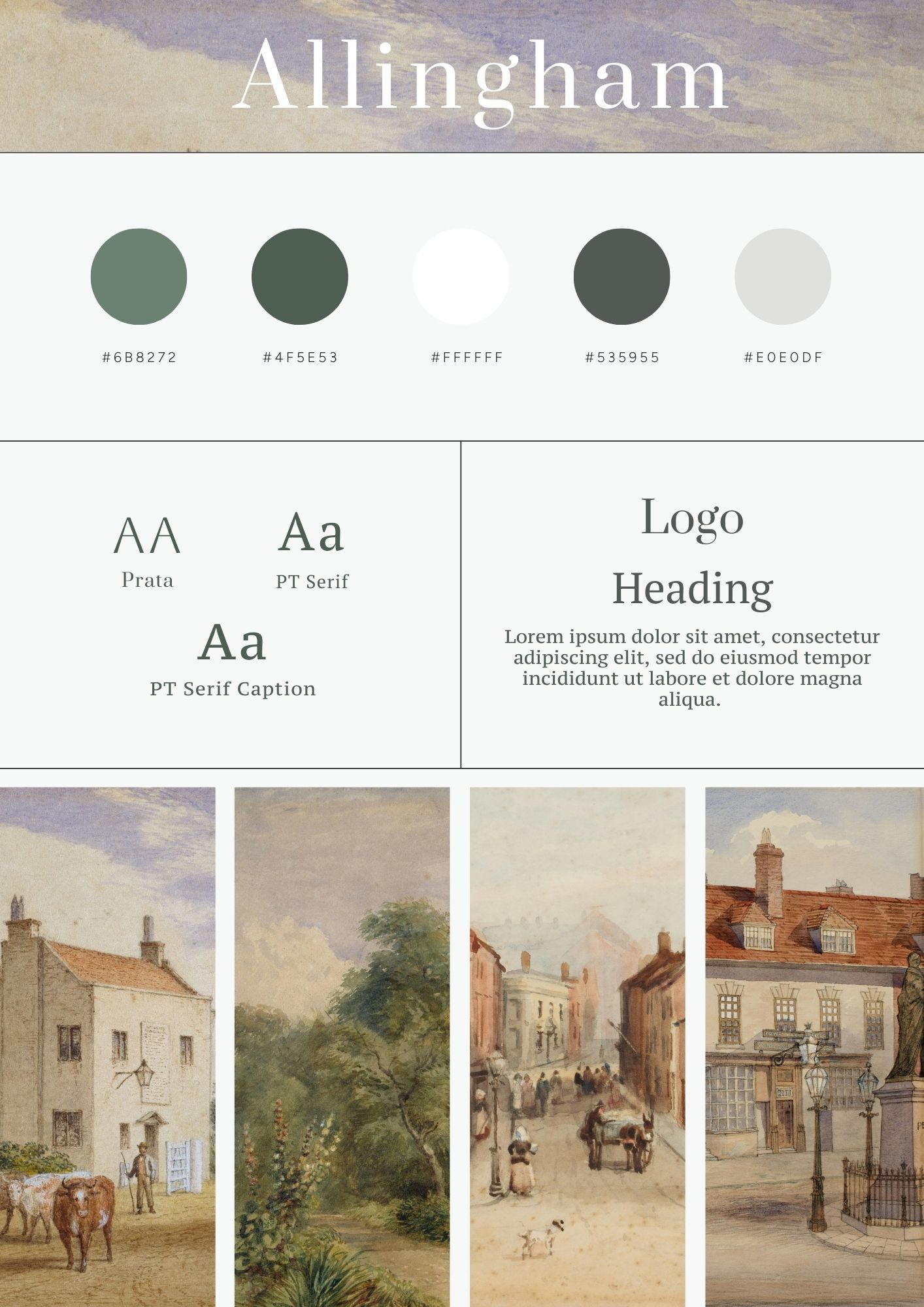
You can see how this process could have created the Allingham website template. It clearly takes inspiration from the traditional watercolour paintings of the artist and embraces soft, muted and off-white tones. This thoughtful approach to colour not only showcases the art itself but also contributes to a calming, immersive browsing experience— perfect for art enthusiasts who want to linger and explore your portfolio in depth.
If your preference is to spend time planning then mood boards are a powerful way to gather inspiration and refine your ideas for layout and branding.
A mood board will enable you to visualise your ideas effectively and think about what you want to achieve from your new website. You can include as much or as little as you like, what colours work for you, textures you like, fonts and lettering, and images that evoke certain feelings.
This process will help you to figure out what you want your website to look and feel like.
You can do this the old fashioned way by grabbing a piece of paper, glue stick and some magazines you’re happy to cut up. The great thing about magazines is that if you have some that fits similarly with your target market, they’ve already researched what styles resonate best with your audience and this can help give you some inspiration for your website.
Nothing is set in stone with a mood board, cut things out, arrange them on your card and when you’re happy stick it down with your glue. You’ll be able to refer back to it as you move forwards with your design decision making.
If you’d rather take a digital approach then making your mood board using a graphics programme or a tool like Pinterest can be an easy alternative. Make a new private board over on Pinterest so it’s not visible to anyone else, upload your own photos and save other pins that help create the look and feel that you’re after. Muse Pinterest Example Link
As you’re working through this process take the following steps:
Gather Inspiration: Compile images that resonate with your craft—anything from texture swatches to color palettes and photographs of your work in progress.
Identify Common Threads: Look for recurring shapes, patterns, or tones that will define your style.
Refine Your Focus: Decide what feeling or message you want your website to convey (e.g., warmth, minimalism, vintage charm, etc.).
As you can see from our example below for Muse, arranging your product images on a mood board is an easy way to start this process. You should see a look and trend becoming apparent - in this example the mood board highlights a calm neutral palette with earthy tones. We’ve then used what we can see to create a soothing and sophisticated website design.

2. Logo & Typography: Express Your Brand’s Personality
Your logo and font choices speak volumes about who you are as an artist or maker. By creating a mood board first, you already have ideas for your brand and this can help the process of creating a logo.
When you’re thinking about your logo, consider how it could represent your work, who you are, or the nature of what you do. If you are creating a portfolio site are you using your own name, creating a brand name for your work or perhaps just using your initials to represent you more ambiguously?
It’s likely you’ll already be promoting yourself in some form that can be included into the website you’re designing, but if you need a logo, or want to design something new, either reach out to a professional designer or try your hand with some of the online tools available.
To truly personalise it to you, think about how you can add your own art or emblems. A painter might use a brush stroke or draw the logo, while a ceramicist could opt for a simple outline of a pot. Our example shows a selection of floral shapes that have been sketched out to be paired with a graceful font.
While you’re thinking about your logo design you should also consider your supporting typography. All our pre-designed templates come with paired fonts that have been chosen to compliment each other.
You should choose a Logo font, Heading font and a Content font for your text. Our tools use Google Fonts which load with your website on any browser and are free to use, we recommend choosing from these to help maintain consistency across all your branded content.
You can also consider other accent fonts in your imagery but it’s best to keep different fonts to a minimum as using too many fonts on your website can detract from both the aesthetics and functionality. Inconsistency can distract your reader and make your content look unprofessional.
Therefore pair your fonts thoughtfully and consider your audience. Fonts can be used to evoke feelings and set the tone for your website. A bold, artistic headline font can work well with a simpler body text font. When choosing fonts also consider your audience, if they are likely to have any visual impairments choose simple easy to read fonts, or if the majority of your visitors are using mobiles pick out fonts that work well across all devices.
Overall, a streamlined approach to typography not only looks cleaner but also supports better usability and performance on your website.
3. Theme Colours: Set the Mood
Colour can instantly convey emotion and style. As an artist or maker, you likely already have a sense of which shades fit your work best and designing your mood board will have helped to cement this.
Using the mood board, or the pages of content you’ve already created you’ll be able to translate those instincts into a color palette that is not only in accord across your website, but compliments your content and imagery.
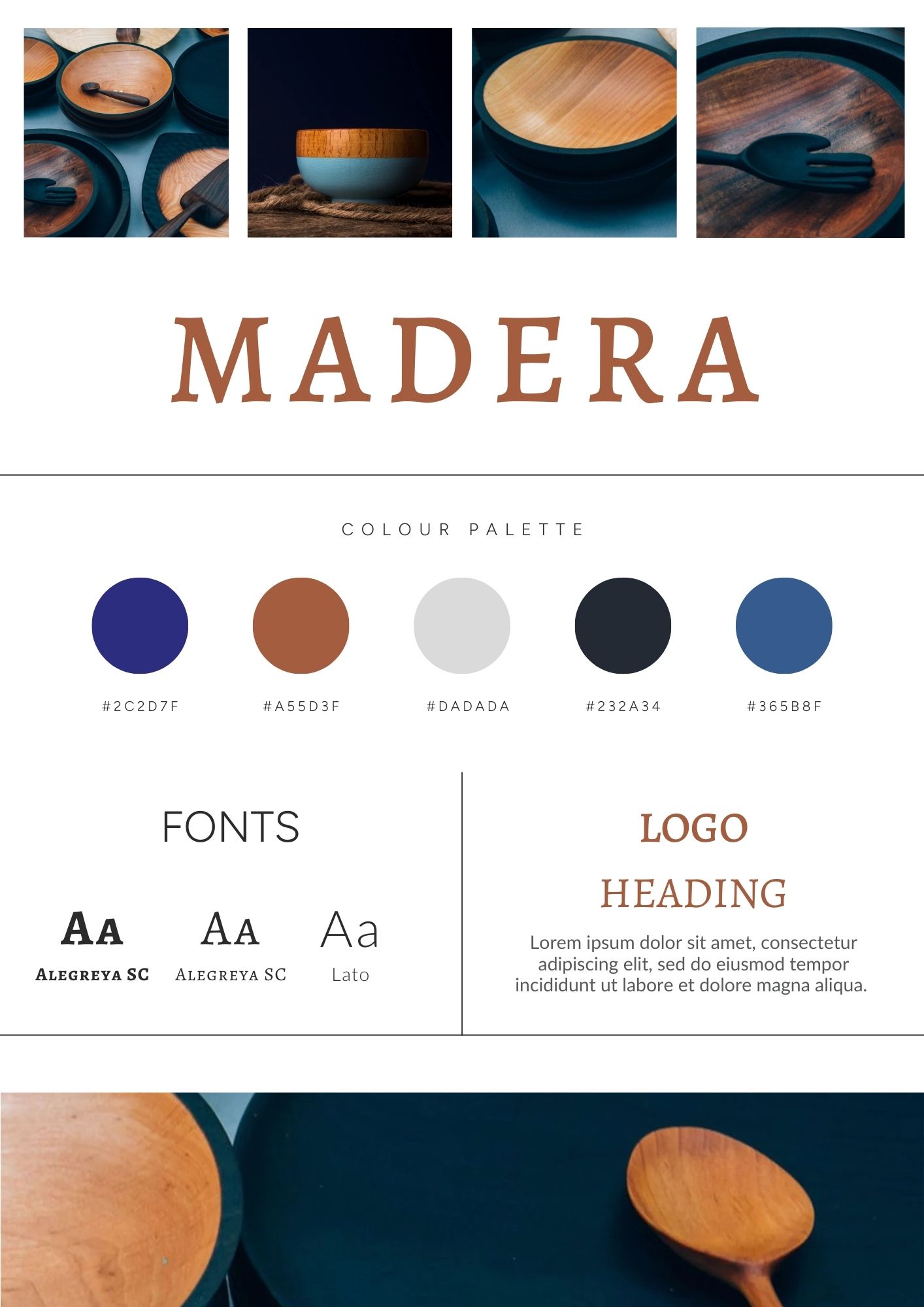
Take a look at this colour palette example for the template Madera. The palette has been designed around existing imagery and creates an earthy, rustic aesthetic. Its warm neutral tones and striking photography combine to become a wonderful showcase of the works of our imaginary artisan.
You can take the same steps to create your own website colour scheme. Look at your paintings, pottery glazes, or materials to pick out your core colours. When you design your site with Create you can set specific colour schemes for your website header, the footer and two colour palettes for your content. These palettes will use some of the same colours and some complimentary ones.
Try pairing a neutral base with one or two accent shades, or a dark base with a few lighter content colours. As you can see from the example above Madera is based around a small set of core colours and then a few other shades of close colours to use when you need an accent.
Like typography, less is often more for your colour scheme, and having the right colours can really elevate your design and showcase your work effectively.
4. Style Board: Bringing It All Together
Style boards serve as a visual blueprint for your website’s design, they help you consolidate all the work you’ve put in so far and bring your brand together. It’s not only a useful reminder to keep your design on track but great for ensuring your social media posts and other materials also look and feel cohesive and on brand.
Style boards usually include things like logos, colours, fonts, textures and images, but you can include other elements like icons or flourishes you’ve chosen to use too.
Take a look at our example below for the Muse template. We’ve included the logo, a selection of imagery, the fonts and some of the main colours from the colour scheme. You can see how this distills all the important elements of the themes design into a clear visual display.
If you have more key colours or additional versions of your logo for different uses you could expand the style board to include these. The idea is to make it your own and include what’s relevant and important to your brand and style.
To get started with your own style board identify the fundamental components that will carry your brand's identity across your website. This includes your primary color palette, secondary accent colors, font choices, and any unique visual motifs (such as hand-drawn elements or rustic textures). These core elements will serve as the foundation for your style board and guide the overall look and feel of your site.
Here’s another style board example, this time for the Madera template. You can see how the board ties everything together; the idea of a clean layout with large bold imagery, and the use of fonts in warm colours to provide a visual link to the natural woods used in the products.
Creating your own style board is a useful exercise to validate that all your design decisions work well together.
5. Theming Your Website
Now you have your design directions, you can start applying it to the website you began earlier. First add your website logo and choose how you’d like your website header and footer to look, then set up your fonts.
You’ll see the website starting to take shape, take a look at the About You page you made at the beginning, you’ll see your design choices have changed how it feels and it’ll be feeling more like you.
Applying your website colours is the next step, there are lots of different options here for all the possible elements that can be on your website and this enables you to apply your branding effectively. The colours are broken down into four main schemes, your website header, website footer, main content colour and a contrast palette.
The best way to set up the content and contrast colour schemes is to have one that is a light colour scheme with dark text, and another which is a dark or colourful colour scheme with light text. That way colour can be used to break up the content, create distinct sections of your website, or highlight specific important elements.
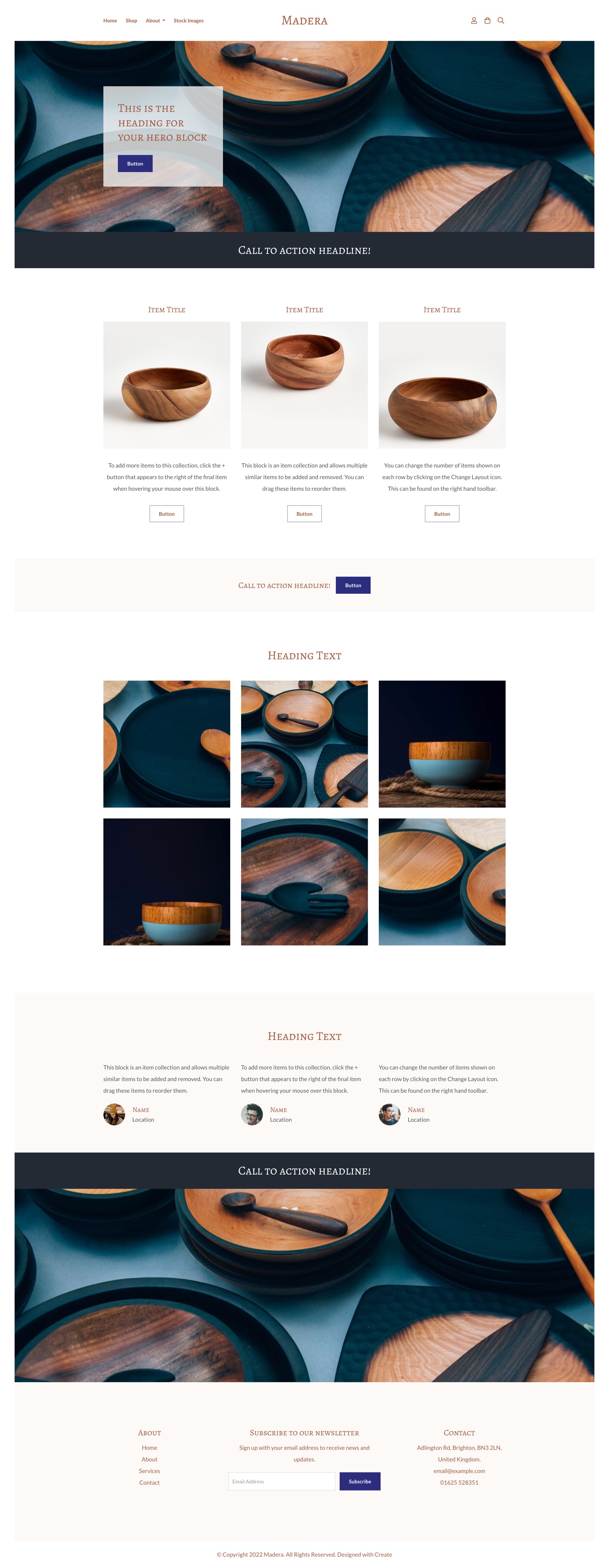
You can see how this works if you look back through the images of the example themes above, Madera has a dark slim section for a call to action which is different to the white and softer colour of the main content, Allingham uses a dark green in the same way to draw the visitors attention to get in touch and Muse uses the contrast palette to break up the content and make specific sections pop.
You can use colour in these ways on your own website too, just think about when you want to give the visitor a visual cue that they’re reading a different section, to grab their attention, or simply as a way to add interest to your design and layout.
There are lots of different ways you can apply your brand and style to the elements of your website, and the above talks about just a small portion of these to get you started. As you learn how to design your website you’ll explore more design elements to style, ensuring your website is unique to you and reflects the work you’ve put in to create it.
Ready to Build Your Own Artistic Website?
Design isn’t something that happens overnight—it’s a journey of experimentation and discovery. The key takeaway here is simple: start small and build on your ideas as you go. Today, pick a template that resonates with you, even if it’s not the “perfect” one, and begin customising it with your unique style. Create a basic mood board using images, color swatches, and typography that reflect your work, and let that guide your initial design choices.
Once you have your first pages up—be it a gallery showcasing your work or a personal bio—take a moment to review them and then tweak and refine these elements gradually. Remember your brand and website live and breathe with you, they’re not set in stone and will evolve alongside you.
I hope this article has inspired you to create a website, and given you an insight into how you can achieve it too. If you want to get started straight away and like one of the templates I’ve showcased in this article you can choose from the links below to begin:
Start your free website trial with Allingham
Start your free website trial with Muse
Start your free website trial with Madera
P.S. There’s many more themes to choose from and you can change at any time once you sign up to build your website with our free trial.