Blog > Top Design Mistakes To Avoid When Building Your First Website

Jack Lloyd
Product Marketer
When I designed my first website, I was winning absolutely no prizes for the work I put in. To be honest, it looked kind of like one of the badly printed leaflets that get snuck through your letterbox and get thrown straight into the recycling.
The sad thing is that it took me ages to put it together. No matter how hard I tried, nothing seemed to fit. Colours conflicted, information was scattered, and there needed to be clear calls-to-action. Those points are just the start!
Over the years working at Create, I’ve picked up a thing or two from using our own tools, and from the amazing concepts our Front-End Developer brings to life.
Want Your Own Website?
Start Building Today!
No credit card needed. By submitting this form you agree to our T&Cs and Privacy Policy.
If I were to flashback to a decade ago and offer myself some advice, there are a few design mistakes I would point out. They’re short and to the point, but working to implement these would have made a whole world of difference to my first website.
Obviously, I can’t do that. What I can do, however, is offer them to you. Hopefully, they’ll help you move forward with building your website with confidence and enable your design choices to feel like they just ‘click’. Here are my top design mistakes to avoid when building your first website:
Ignoring your target audience
Before getting stuck in and putting together the pages of your website, it’s important to ask yourself what is going to resonate with the people you want to attract to your site.
When I built my first website, I put together my pages in a way I liked. However, it didn’t really resonate with anybody in particular.
One way I found that is really useful for finding what kind of design choices resonate with a particular audience is to pick up the magazines your target audience is likely reading. Cut out the design elements you think might work for your website and create a board of inspirational materials.
This will really help flesh out a framework for your design and make sure your site lands with the right audience.
Overdoing it with design elements
Having a website opens up a world of design opportunities. Unfortunately, the case could be made that it opens up too many choices.
Often, the temptation is there to add in a whole bunch of design elements simply because you can, without a reason for why they are there.
This was certainly the case with my first website. I had a carousel of images, a sidebar, a live chat tool, a section for advertisements, animations, blog features… the list goes on.
The result of this was a cluttered page that easily overwhelmed visitors. My bounce rate was a very good indicator of this.
A lot of these features can be novel and exciting - used in moderation, they can bring life to your website. However, always be sure to ask what the value is in adding a new element to your page and how it will help you to achieve your website goals.
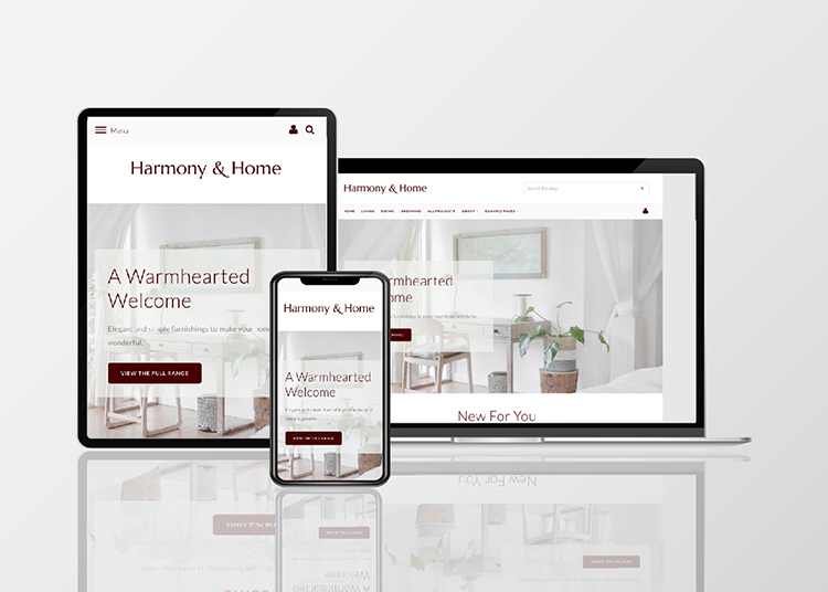
Not making it mobile-friendly
Have you come across those websites where you have to pinch the screen and scroll left and right to read the information and find what you’re looking for? Yep - that was my website any time someone wanted to use the sidebar.
Needless to say, it did not meet the standard for user experience most customers expect when browsing the web.
Your website should be built with mobile users in mind. This is because more people are browsing the web on their phones than they are on a desktop or laptop now. Everything should be clear, readable and easily navigable for these users.
On Create, you can switch between mobile, tablet and desktop views so you can preview how your pages are going to look on different devices. You should utilise this before publishing your website so that your website always offers the best experience for your users, no matter what device they’re viewing your website on.
Using hard-to-read fonts
The choice of fonts you can use on your website is vast. There is a whole library of options at your disposal to fit your branding. However, you need to consider how to use them properly so that your content doesn’t appear hard to read.
On Create, you can select a font for your logo (if you’re not using an image file), your headings and your body text.
Your logo is your branding and so it allows you a degree of freedom and creativity in your choice of font (it should still be readable and, of course, visually memorable).
Your headings and body text, however, should lean towards being more practical. Try to avoid glamorous or wacky fonts that are difficult to read. Your goal is to convey information quickly and effectively on your pages and a simple font will help you to do this enormously.
Trying to convey too much at once
A mistake I commonly used to make (and I still see quite often) is that I used to fill my pages with big blocks of text.
It’s an easy trap to fall into. When you’re talking about your business and what you offer, you feel like you need to cover all bases and be as detailed as possible.
Being concise with your content takes practice but it pays off in a big way. When people visit your website, they’re scanning for what they’re looking for. Long paragraphs just make this more difficult for them.
Try to condense your key points into their simplest form - No more than 2 or 3 sentences - to help your users quickly and efficiently find what they want from your website.
You can also use images to compliment the key points you're making instead (after all, people say a picture speaks a thousand words). This keeps your pages visually engaging and helps drive home the points you’re trying to make.
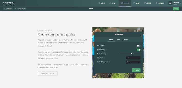
Ignoring white space
This point may seem counterintuitive. It feels natural to eliminate white space and compress the information on your page so nothing is wasted and everything is optimised.
In fact, the opposite happens for much the same reason as some of the previous points. With each section of your page butted up to the next, your layout can feel overwhelming.
White space, or negative space, is an important design element that helps to balance your page layout and make it easier to read. It’s almost like you’re allowing breathing room on the page so that each point can be properly absorbed before moving on to the next.
If you’re looking for a way to quickly make your pages feel cleaner and more professional, it could be worthwhile experimenting with bumping up your Block Padding.
Don’t be afraid to utilise white space on your page and give each key section room to stand out.
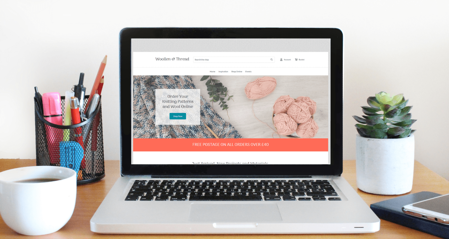
Using low-quality images
As previously mentioned, pictures can speak a thousand words. They can evoke emotions, draw connections and visualise concepts in a way that words often can not.
I remember with my first site, I had a lot of trouble getting my head around aspect ratios and creating the proper files that would allow me to display high res imagery on my site. Alas, it reached a point where I just said “It’ll do”.
Unfortunately, where high-quality images can transform a website for the better, low-quality images appear as a red flag to many visitors. It’s important to take the time to make sure your images look professional so that your business reflects that too.
Luckily, there are platforms like Canva now that allow you to create professional files for your website really easily, and sourcing high-quality, free imagery is also not as difficult as it once was. (You can check out our blog for a list of resources you can use).
Images can make or break a website. Be sure not to settle for anything less than high-quality and take the time to acquaint yourself with Canva. It’s one of my favourite tools for sourcing images and creating graphics for everything from websites to print materials.
One more thing: If you’re on Create, you can import professional photography directly from Unsplash into your image library.
Creating pages that don’t serve you
I used to have pages for everything. I had a blog archive that neither myself nor anyone else ever used. I had pages for unrelated services I used to offer. Heck, I think I even used to have a whole page dedicated to my hobbies at the time.
Needless to say, my website was overinflated and the sheer number of pages it had distracted from the actual purpose my site was meant to serve.
This is a rather dramatic example (I really don’t know why I had those pages looking back) but there is a lesson to be learnt from it.
Are there pages on your site that aren’t truly serving you? The best designs are often the most simple. Embellishments don’t enhance the purpose of your site. They dilute. They distract.
Keep in mind the purpose you created your site for; your main objective. Which pages help your users accomplish this goal and which distracts them from taking action? It could be time to let these extra pages go.
You can find out more about this idea and meeting your goals in my blog about website objectives.
Not using calls to action
Following on from the previous point, when you have a website objective, you have to know how to lead people to take the action you want them to. This is done through effective calls-to-action (CTAs).
As far as great website design goes, it should feel linear. It should feel like you're leading your prospective clients or customers through the information they need and always pointing them to the next step.
Consider the buttons and/or links you have on your pages. Where do they lead? Are you taking your visitors by the hand on a journey or are you signposting them to all the things that you think they might be interested in?
They should feel free to choose wherever they want to go on your site. However, it’s your job to make sure the next step to getting the value they are looking for from your website is always to hand.
Always try to keep your objective in mind and make it accessible to the people visiting your site.
Not testing your website
If you’ve come this far and are utilising the previous tips in this post, you should be well on your way to publishing a beautiful and effective website.
There is one last step that’s so very important before you start releasing your website to the world. You must test it.
So far, everything works in theory, but undoubtedly there will be things you’ve missed or overlooked that could improve the experience of your website.
It’s great if you do one or two run-throughs by yourself. However, it would be ideal if you ask a friend or family member to test your site for you. Make sure to note how they move through your website and if it’s how you intended.
Even better still if you’re able to watch over their shoulder as they use your site and note if there are any distractions or difficulties as they move from page to page.
It’s the final step to publishing a website that works. Properly testing your site can help iron out the last few problems while also offering you peace of mind that everything is working as you intend.
Wrapping up
By avoiding these design mistakes, you can create a successful first website that effectively serves your business and engages your audience:
-
Ignoring your target audience - research your audience using materials they’re likely already interested in and try to incorporate some of these elements in your design.
-
Overdoing it with design elements - Always consider the value that each feature brings to your site. Too much can overinflate your pages and can become overwhelming
-
Not making it mobile friendly - Double check how your site appears on mobile, tablet and desktop. Especially mobile as most people will be viewing your site on their phone.
-
Using hard to read fonts - For your headings and body text, try to keep your font clear and simple so it’s easier for your audience to read and digest information.
-
Trying to convey too much at once - Long paragraphs can overwhelm visitors. Try to be concise with the points you are making and keep your content scannable.
-
Ignoring white space - Used properly, white space can create more impact for your key points and balances your content so visitors can properly take in what you’re saying.
-
Using low-quality images - high-quality images make sure you’re setting the right first impression. There are lots of free image resources available to help with this.
-
Creating pages that don’t serve you - Keep in mind how each page fits into the objective of your website. Don’t overinflate your site with pages you don’t need.
-
Not using calls-to-action - Try to create a linear journey across your site where you guide your visitor to take action by using buttons and links thoughtfully.
-
Not testing your website - The final point to make sure everything runs smoothly. This works especially well with a friend or relative to help test your website for you.
I’m pleased to say I’ve come a long way from the days of making these mistakes (prolifically I might add). The problem was that I was learning to build websites on my own.
I needed feedback, and a community, to guide me and share their experiences. On the first platform I used, even the company’s support team couldn’t offer me any assistance.
That’s one of the great things about Create. Sure, you will still be building your own website. However, our Account Managers are on hand to help with any questions you may have and our exclusive Facebook community is also available for you to get ideas and feedback. They’ll help you to action your plans and improve your site far faster than I could have thought possible back in the day.
Want Your Own Website?
Start Building Today!
No credit card needed. By submitting this form you agree to our T&Cs and Privacy Policy.
Want more tips and ideas on how to start and grow your website? You can make sure you never miss a trick by getting our email updates. We share the latest news from our blog along with tips and ideas you can utilise to grow your business online.