Help Centre
Support > Designing and Building Your Website > Designing Your Website
Is my website mobile friendly?
Create websites are designed to be fully operational and look great on all devices including smartphones and tablets with the use of HTML5 website templates and our content builder.
A fully responsive website will scale to the size screen it is being viewed on, which great for both your customer experience and for your SEO.

All of our current responsive themes and templates are mobile-friendly so you can be certain that your website will look fantastic on all devices if you select one for your website. If you’re unsure that you are using one of our current templates, you can view all of our fully responsive website templates here.
To get the best from our templates and ensure your website is fully responsive, you want to be using our Content Page type. This page type comes with our latest content builder that makes it very quick and easy for you to build beautiful looking websites.
If you’re unsure what page types you have in your account, please see this help guide for more information about your site content.
We have also put together a guide that explains the process of adding Content Pages and how to move content over from our older pages to this page type. Please see this help guide for more information about this.
Our templates don’t contain Flash, so your website is fully functional on all smartphones and mobile devices. However, please note that some widgets and third-party code you may use could contain Flash.
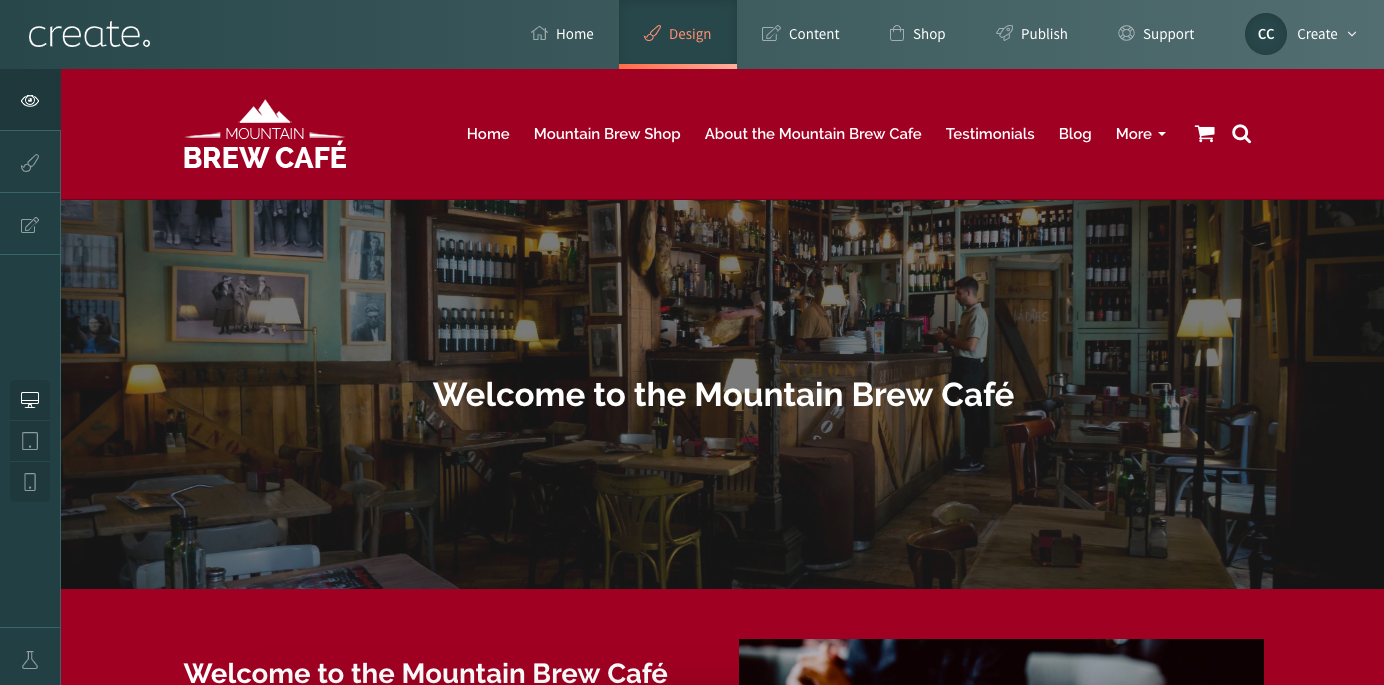
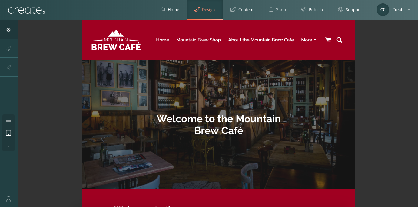
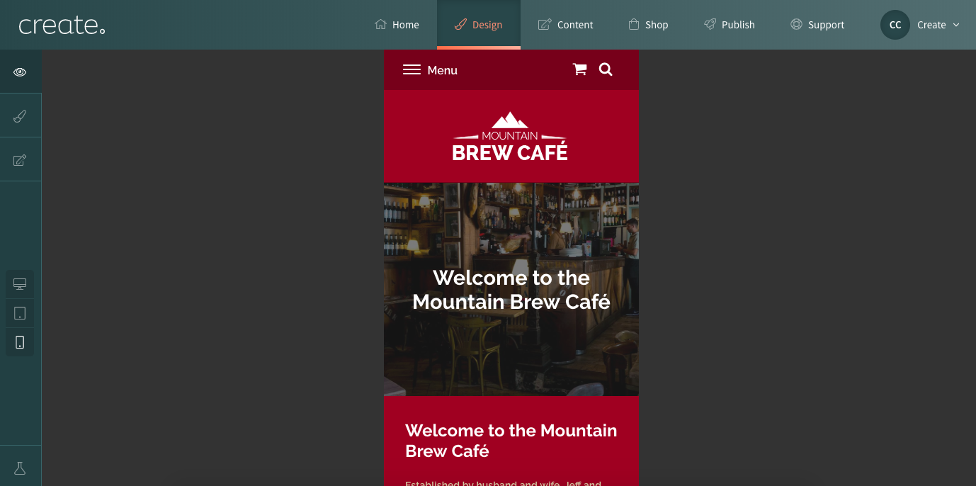
When constructing your website, it’s good practice to keep in mind how your website looks on all platforms. With Create, it’s very easy to preview how your website looks on different screen sizes by accessing the Design Studio in Create. On this screen, there are 3 icons representing desktop, tablet and mobile.

Clicking on these icons will preview how your website will look on one of those devices. You can fully navigate your website in each of these views to see how it looks.
Desktop View
Tablet View
Mobile VIew
Google also has a tool to test how Mobile Friendly your site is, and how to improve areas where it falls short. This is a useful tool to give you some guidance on how well your website performs on mobile. You can try the Google Mobile Friendly test here.
Simply enter your websites URL address and then Google will test your website and display a results screen, as shown below.
Related Articles


More Questions?
If you have any further questions, please get in touch and we will be happy to help.
Get in Touch