Blog > Landing Pages: A Beginner's Guide to Accelerating Online Success

Jack Lloyd
Product Marketer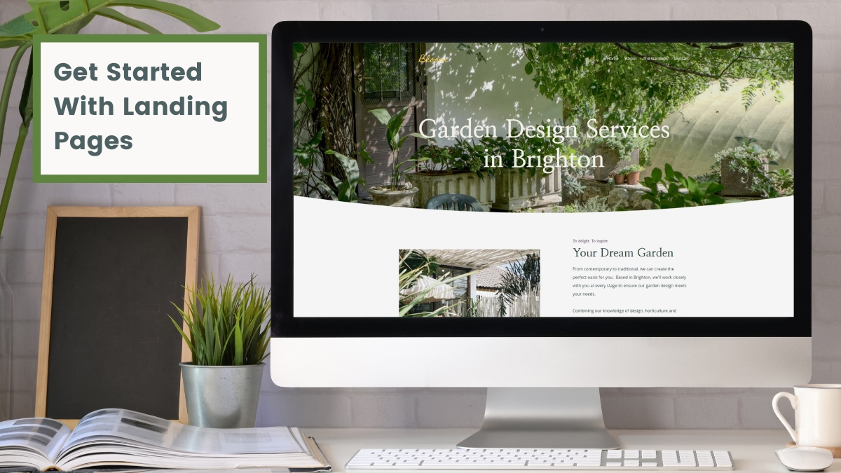
Do you find that you’re struggling to get many website visitors? Then those who do visit, they don’t seem to take any action on your website?
If this feels all too familiar, fear not; you're not alone. Many website owners find themselves in this predicament.
There’s a whole lot of noise online with everyone vying for the attention of potential customers. How do you rise above this and reach the people you want to reach?
One answer is landing pages.
For those who have built a website, acquired a bit of a following and feel ready to take the next step, landing pages are the mechanism that will rocket you to the next level of marketing and conversions for your website.
In this article, I’ll explain what landing pages are, and I'll go through exactly what you need to know in order to get started.
There will be ideas and examples along the way, so hopefully you’ll leave here with a bit of inspiration to get you going too!
What Are Landing Pages?
In simple terms, a landing page is simply the first page people arrive at when they visit your website. In many cases, this is your home page. It could also be a blog, or any other page of your website.
So if these are all landing pages, what’s the big deal?
We can specifically build landing pages that are designed to welcome particular visitors to your website and put them on a journey that feels tailored to them. This can be huge when it comes to keeping them on site and hopefully becoming a customer or client.
As a few examples, you may build a landing page to bundle up certain collections of items suited to a particular customer. You might also have a page that explains the value of signing up to your mailing list and encourages people to take that action.
There are loads of examples we could run through, but each landing page should be the start of a tailored journey on your website with a singular goal in mind (and usually with a particular audience or buyer in mind).
Where Are Landing Pages Most Useful?
Landing pages are incredibly versatile and can be used for a wide range of different marketing projects. Here are some key scenarios where landing pages prove to be the secret sauce of success:
-
Product Launches: When you're introducing a new product or service, a dedicated landing page can generate buzz, highlight features, and drive early sales.
-
Email Marketing: Landing pages are perfect companions to your email marketing campaigns. They provide a focused page to elaborate on your email's message and encourage subscribers to take action.
-
Event Promotion: If you're organising a webinar, workshop, or any event, a landing page can serve as the central hub for registrations, event details, and attendee engagement.
-
Lead Generation: Landing pages excel at capturing valuable leads. Whether you're offering an eBook, free trial, or a consultation, these pages entice visitors to share their contact information.
-
E-commerce: In the world of online retail, landing pages can spotlight specific product categories, seasonal offers, or limited-time promotions, driving conversions with precision.
-
Advertising Campaigns: For pay-per-click (PPC) and social media advertising, creating targeted landing pages that align with your ad's message ensures a seamless transition from ad to conversion.
In most of your marketing projects, you’ll find landing pages may well become an essential and powerful asset to your campaigns; adapting to your specific needs and objectives. They allow you to craft tailored experiences that guide your visitors toward the desired action.
Components of a Successful Landing Page
Building a landing page isn’t all that different to building any other page of your website. The process remains the same, but there are some key components that will help you to succeed:
-
Attention-Grabbing Headline: Start with a compelling headline that instantly communicates the page's purpose and value proposition. It should capture the visitor's attention and encourage them to keep reading.
-
Engaging Content: Craft persuasive and easy-to-read content that addresses the visitor's needs and pain points. Try not to write huge paragraphs. Keep your selling points concise and punchy.
-
Eye-Catching Visuals: Incorporate relevant images, videos, or graphics that enhance your message. Visual content can help convey information quickly and keep visitors engaged. Try our Unsplash Integration for free professional photography.
-
Clear Call to Action (CTA): Your CTA is the linchpin of your landing page. It should be prominently displayed, using action-oriented language that tells visitors exactly what you want them to do, like "Sign Up Now" or "Get Started."
-
Form or Opt-In: If your goal is lead generation, include a form or opt-in section where visitors can provide their contact information. Keep it brief and only request essential details to reduce friction.
-
Social Proof: Boost trust and credibility by showcasing testimonials, reviews, or case studies from satisfied customers. Social proof has been proven time and again to massively support online conversions.
-
Analytics and Tracking: Implement tracking tools like Google Analytics to monitor the performance of your landing page. Analyse metrics like conversion rates, bounce rates, and traffic sources to refine your strategy.
You’ll want to keep revisiting and adjusting your landing page over time. Monitoring the analytics and using the data can help you to make focused improvements that contribute to your landing page’s effectiveness. The above points are all an important place to start building a page that works!
How To Use Landing Pages in Your Marketing
When thinking about using landing pages in your marketing, it can be helpful to think of them as three-step funnels towards taking an action. There can be any number of steps, but the simple formula boils down to:
-
Communications - How you promote your landing page and get the right people to visit it
-
Landing Page - The page itself and the key selling points you convey
-
The Action - The thing you want your visitor to do and that you consider as a conversion
Let’s take an example to see this in action. Let’s say Valentine’s Day is approaching and you have lots of jewellery items you’d like to sell to loved-up couples.
You build a Landing Page that showcases all of the specific romantic items that would be appropriate from your shop. You may even run a promotion. The page might look something like this:
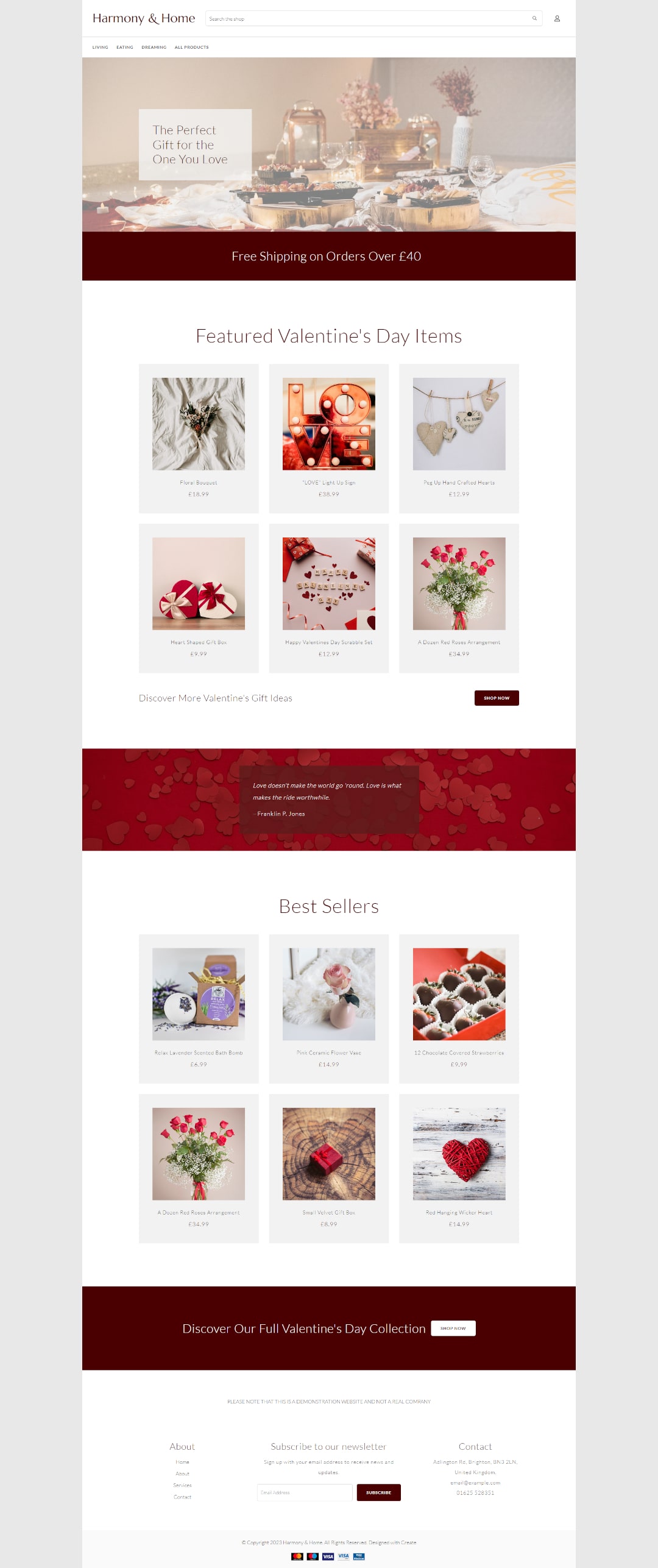
It’s safe to say the action you’d like people to take from visiting this page is that they buy something (or some things). However, having this page also allows you to tailor your communications to be really specific.
You can launch a whole marketing campaign around this page, including social media, email, paid ads and more. All these posts and communications all lead to this one landing page as part of this campaign.
Additionally to this, you can better track the success of your campaigns by analysing the data on your landing page, such as how many people clicked through from your marketing, how many engaged with your content, how many converted, etc.
This is how Landing Pages can streamline your marketing and can help you to find more success when communicating with your audience.
Let’s look at some more examples of landing pages, the scenarios they’d be used and how they can help you:
Harmony & Home - Selling Christmas Products
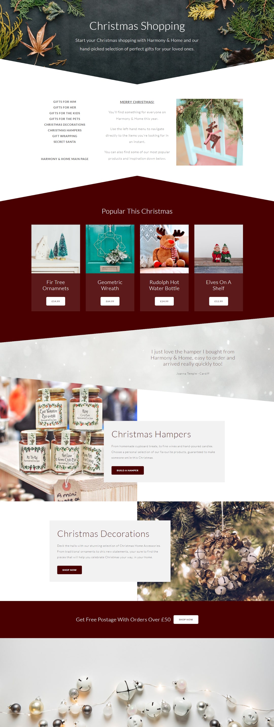
Landing pages are perfect for promoting your selections for seasonal events. We’ve already covered Valentine’s, but this can be replicated for Easter, Halloween, Spring or any other seasonality that suits your store and products. Christmas is generally the biggest of these so it seems only right to dive into a festive-themed example next.
One of the traps many fall into when creating a seasonal landing page is building what feels like another category page. Instead, your landing page is an opportunity to organise your best offerings, and help users navigate to what they’re interested in.
Harmony & Home does a great job of this. At the top, they have a quick-use menu to direct visitors to the relevant Christmas Category they may be looking for. This is prominently placed for efficiency and a smooth user experience.
The page then proceeds to celebrate their most popular items, promote their bespoke hamper service and put forward a featured decorations category.
Of course, there’s a testimonial and special offer on the page as well to encourage conversions.
When this page has been built, it’s perfect for sharing across social media. You might even choose to have this page as your social profile link throughout the festive season.
You may also find this page gets picked up by search engines and provides some traffic through results pages. For this reason, we always suggest not to delete your seasonal pages when the event is over. It’s better to keep them hidden and allow them to maintain their search authority rather than start from scratch each year!
Bloom - Boosting Their Local SEO
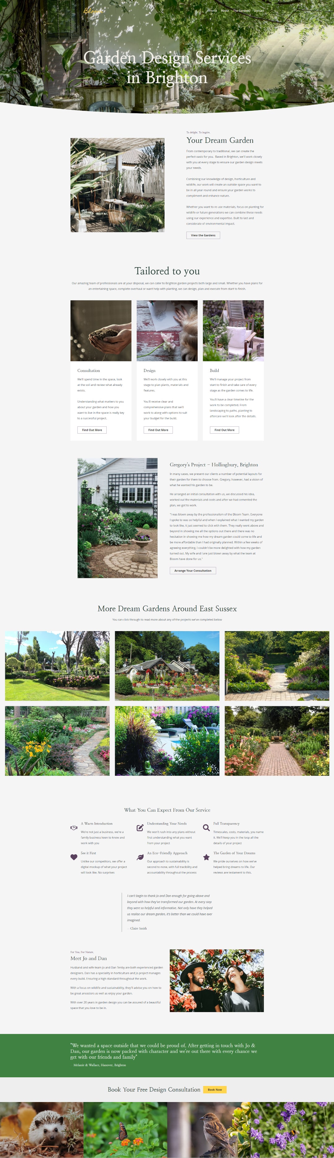
Let’s say you run a business that caters to a few different local areas. One of the most valuable sources of traffic you can acquire is from local search engine users looking for the services you offer online.
We’ll use Bloom as an example; a garden design company based in Brighton. While Bloom is based in Brighton, they’re able to take contracts as far away as Littlehampton with the scale of the projects they take on.
Everyone looking for Garden Design services through Google will be searching along the lines of “Garden Designers in <location>”. With this being the case, to optimise Bloom’s home page for “Garden Designers in Brighton” would be at the expense of optimising for Littlehampton and anywhere in between.
Landing Pages can help to resolve this. Bloom can create several different pages in much the same format as their home page, but targeted at different areas. Each can talk specifically about how Bloom services that area and the page can feature location specific case studies and testimonials.
There’s no need to sacrifice the extent of your local SEO to focus on one area. Landing pages therefore enable you to rank in different locations with hyper relevant content to the people you’d like to reach.
Woollen - Promoting Event Tickets
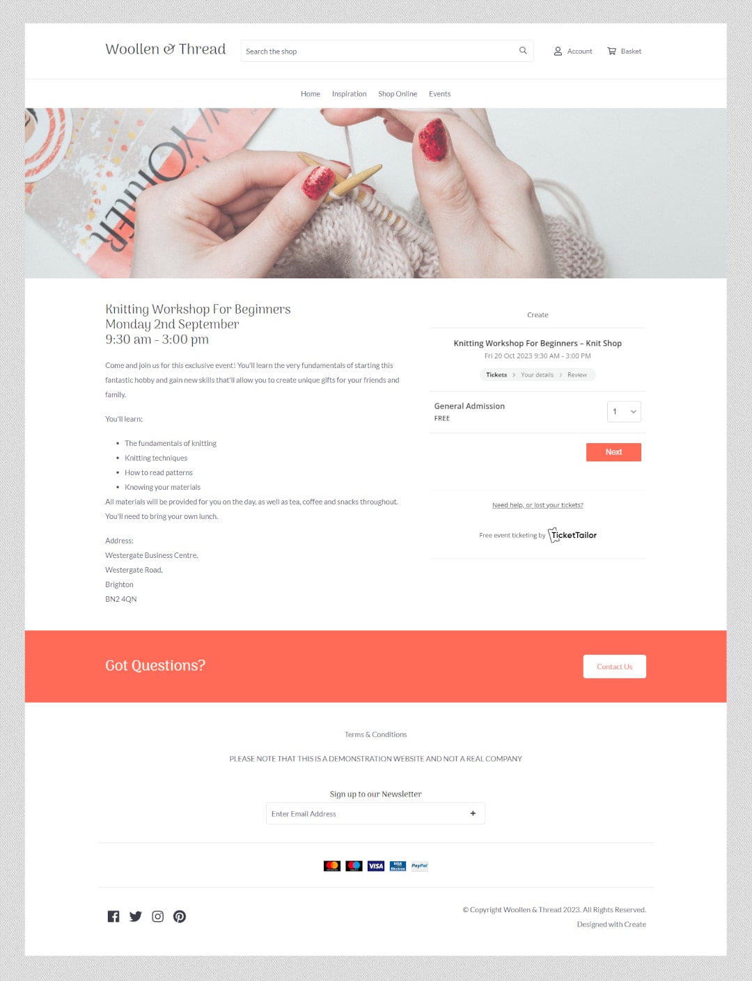
Landing pages don’t need to be long and complicated to work effectively. Take this event listing for example.
Woollen has created a page purely dedicated to distributing event tickets to their workshop. It primarily features one Custom Block that utilises TicketTailor’s event plugin.
The purpose of this page is simply to explain the event details and walk users through the process of claiming their ticket.
As you might imagine, this event will be publicised across their social media channels regularly. Woollen will share the key value propositions there that will encourage people to want to claim their ticket.
By the time users get to the page, they should already be sold on wanting to claim their space for the workshop; so it’s therefore important to keep the process as simple and straightforward as possible.
The key to remember is that Landing Pages should have a singular goal in mind, and be optimised as best as possible to achieve that goal. It doesn’t always matter if you’re not actively selling your products or services at each point, so long as the user takes action!
Shine - Building An Email List
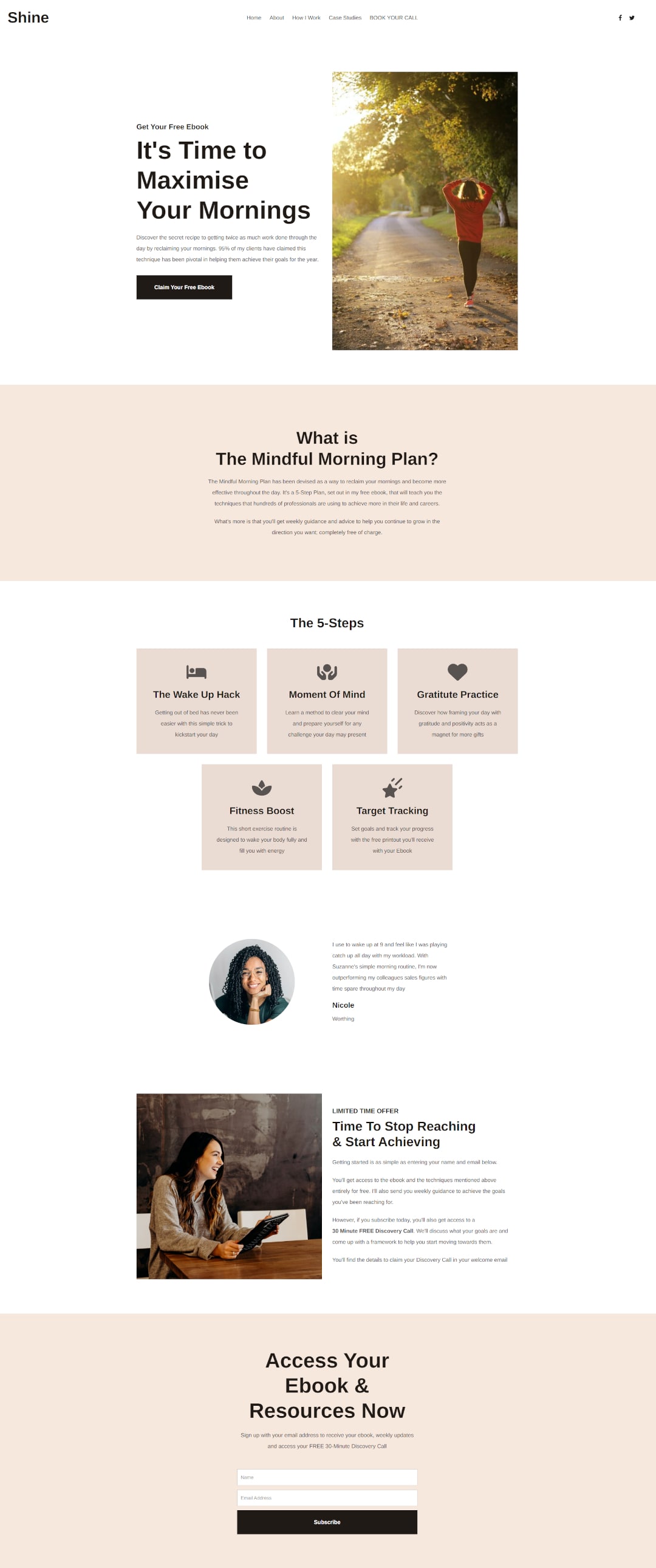
Landing pages are ideal for building an email list. They can become the very first step of a content marketing strategy that keeps bringing you customers or clients time and again.
Shine focuses on building their email list using a Lead Magnet. A lead magnet is simply something that is offered for free in exchange for a user's email address typically.
In this instance, the lead magnet is a free ebook. The page discusses the value someone will receive from downloading this ebook through short, key-value, points and testimonials.
When someone signs up, the welcome email will give them all the free resources mentioned on the page, and in exchange, Shine now has a new email subscriber.
This subscriber has demonstrated by signing up that they see value in the services Shine has to offer. Shine can now send them more content they’re going to find valuable as well as prompts to engage with the services they offer over time.
If you are actively creating content, it doesn’t take a lot to create a free resource that people will love. By encouraging them to sign up to your emails by giving away some extra special content for free, you can create a valuable marketing list to promote your content to every time you release something new.
Wrapping Up
We’ve only covered a few examples above, but really, the applications of landing pages can go far beyond this. With a bit of practice, you’ll find they can help you level up your marketing, data and conversions.
To see what landing pages can do for you, you’ll have to experiment. Come up with a goal, a landing page that can help you to achieve that goal, and then plan who you’re going to market to and how.
Before you know it, you’ll be creating dozens of landing pages for all kinds of projects as soon as you see the potential within them!
Want more tips and ideas on how to start and grow your website? You can make sure you never miss a trick by getting our email updates. We share the latest news from our blog along with tips and ideas you can utilise to grow your business online.