Blog > Simple Tips For Making Your Website More Accessible

Why Website Accessibility Matters
Creating an accessible website isn't just about checking boxes - it's about making sure everyone, regardless of ability, can use and enjoy your content. Accessibility means building your site so that people with visual, hearing, motor, or cognitive impairments can navigate, understand, and interact with it easily.
Whether you’re running a personal blog, small business, or online store, making your website accessible helps you reach a wider audience, improves overall user experience, and can even boost your SEO. And the best part? Many accessibility improvements are simple, especially when you plan for them from the start.
In this post, we’ll walk through practical tips and considerations to help make your site more inclusive, starting with the theme you choose.
Choose Accessible Colours and Fonts
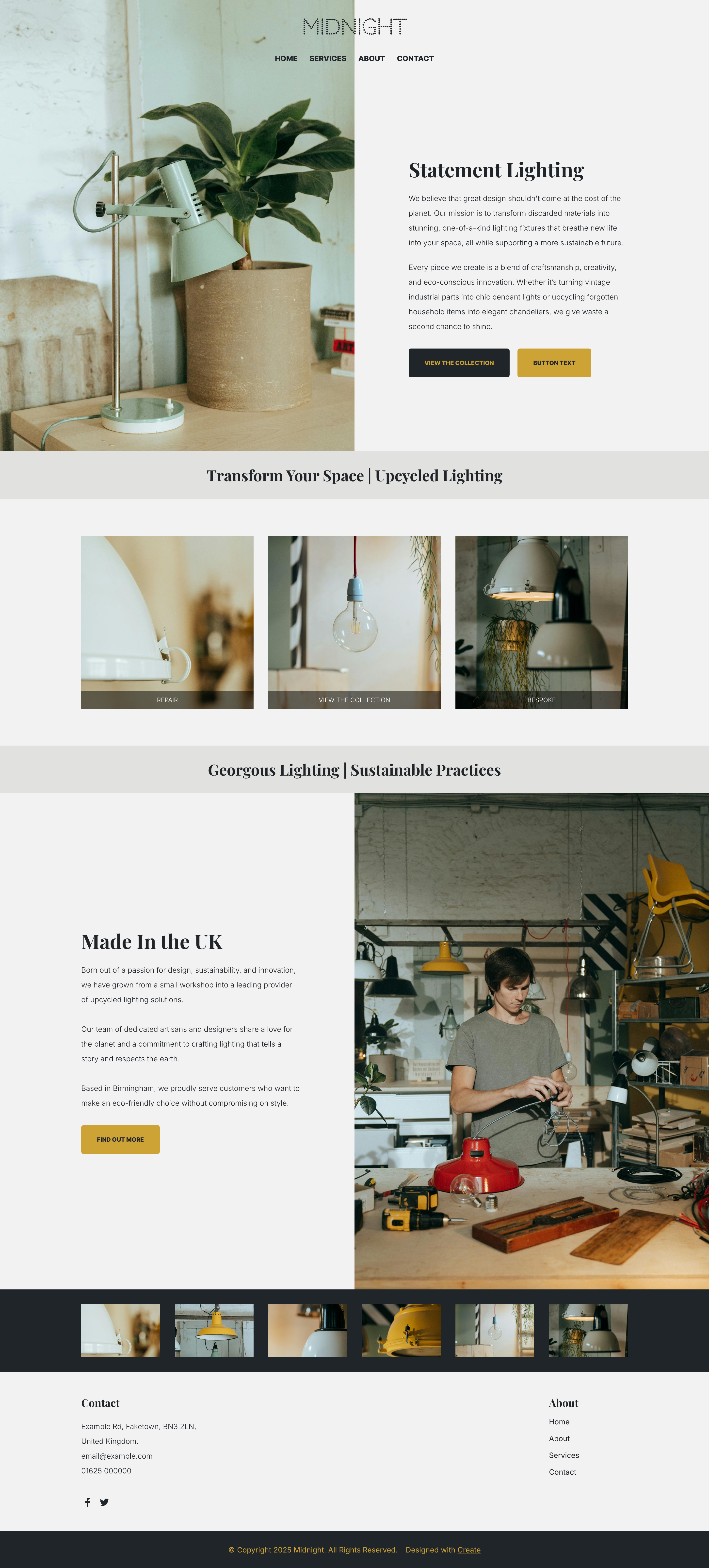
All of our templates are mobile-friendly by default, which gives you a solid head start when it comes to accessibility. From there, it's up to you to make thoughtful choices around colour and typography to ensure your site is easy for everyone to read and interact with.
When customising your site’s design, consider the following:
Pick a clear, easy-to-read font
Stick to clean, simple fonts that are legible in a variety of sizes. Sans-serif fonts (like Arial or Open Sans) are generally easier to read on screens. Avoid overly decorative fonts, especially for body text.
Ensure strong colour contrast between text and background
Good contrast helps users with low vision or colour blindness read your content without strain. As a general rule, dark text on a light background (or vice versa) works best. You can use online contrast checkers to make sure your colours meet accessibility standards.
Be mindful with background colours and images
If you use a background image or a coloured block behind text, make sure the text remains clearly readable. You might need to adjust the image brightness or overlay it with a semi-transparent colour for better legibility.
Structure Your Content Clearly
Good structure is the backbone of accessible content. It helps users, especially those using screen readers or other assistive tech, make sense of your pages, follow your ideas, and find what they’re looking for without confusion.
Here’s how to create a solid, accessible structure:
Use clear headings to break up content
Headings give your page a logical hierarchy. They help users scan the page and assistive technologies understand the structure of your content.
Keep paragraphs short and scannable
Big walls of text can be hard to read, especially for people with cognitive disabilities or those reading on small screens. Aim for short paragraphs, clear language, and plenty of white space.
Use bullet points and lists where appropriate
Lists are easier to process than dense paragraphs, especially when outlining steps, features, or tips. They also help screen readers convey content more efficiently.
Make buttons and links easy to identify
Use descriptive link text (like “Download our guide” instead of “Click here”) so users know exactly where a link will take them.
Be consistent across your site
Stick to the same heading styles, content layout, and formatting patterns throughout your pages. This makes your content predictable and easier to navigate, especially for returning visitors or those using assistive tools.
Make Navigation Intuitive
No matter how great your content is, users need to be able to get to it easily. Accessible navigation means designing menus and links in a way that’s easy to understand, consistent across pages, and usable by everyone, including those relying on screen readers or keyboard navigation.
Keep menus simple and consistent
Use clear, descriptive page names like “Home”, “Services”, or “Contact” rather than vague or long page titles.
Limit the number of menu items
Too many choices can be overwhelming. Group similar items under drop-down if needed, but keep the main menu concise so users can find key pages quickly.
Proper Use of Images and Alt Text
Images are a powerful tool for communicating ideas, but they can become barriers for users who rely on screen readers or have slower internet connections. Ensuring your images are accessible with appropriate alt text and thoughtful use will make your content more inclusive.
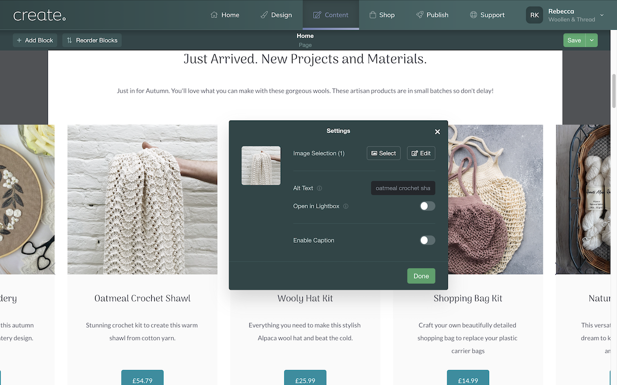
Describe the purpose, not just the appearance
Focus on what the image conveys to the user. For example, instead of “A dog,” describe the action: “A dog playing with a ball in the park.”
Keep it concise
Alt text should be clear and to the point. A brief sentence or two is usually sufficient. Avoid unnecessary details - aim for clarity over length.
Avoid redundancy
If the image is described in surrounding text, there’s no need to repeat that information in the alt text. Focus on what the image adds that isn’t already clear from the content.
Testing Your Website’s Accessibility
Testing your website’s accessibility is essential to ensure it’s usable by everyone, regardless of ability. There are simple ways you can check how accessible your site is and identify areas for improvement:
Use Free Tools Like WAVE or Google Lighthouse to spot accessibility issues.
Navigate your site using only your keyboard (press "Tab" to move between links and forms).
Ask friends or colleagues to test your site and give feedback.
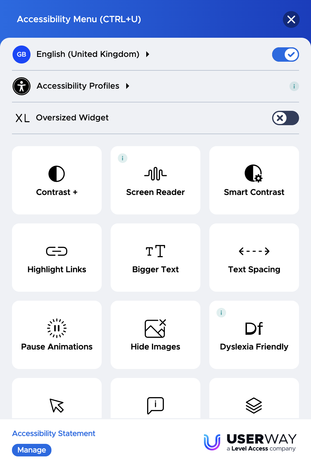
Consider Using an Accessibility Widget
Accessibility widgets can be a great way to enhance your website’s accessibility with minimal effort. These tools offer features that make your site more usable for individuals with a variety of disabilities, without requiring complex coding.
UserWay: One of the most popular tools, UserWay offers a suite of features like text resizing, colour contrast adjustment, and a screen reader. It’s free for basic features and can be customised to fit your site’s design.
AccessiBe: Another widely used tool that offers an automated solution for making websites more accessible. AccessiBe adds options for screen readers, contrast adjustments, and more.
EqualWeb: This tool provides an easy-to-use accessibility toolbar with options like text resizing, colour changes, and voice commands.
Final Thoughts
Improving accessibility benefits everyone, not just people with disabilities. By implementing these simple tips, you’ll create a website that is more inclusive, user-friendly, and better optimised for search engines. Take a few moments today to review your website and make small changes that can have a big impact!