Help Centre
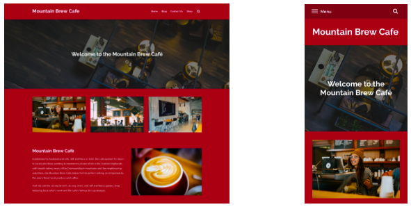
A responsive website is a type of website that is designed to automatically adjust its layout and appearance to fit the screen size of the device it is being viewed on. This means that the website will look and function well on a wide range of devices, including desktops, laptops, tablets, and smartphones.
Create websites are built using responsive templates and Content Blocks. This means that your website will automatically adjust for all types of screens without you needing to do anything extra.
We do, however, recommend that you double-check how your site looks across devices before publishing your site so that everything appears as you would expect. Especially for mobile as this is the device most people are browsing the web with now.
Related Articles
Related Articles


More Questions?
If you have any further questions, please get in touch and we will be happy to help.
Get in Touch